How to Make Your App Store TOS (More) Enforceable

Your TOS link must be “clear and conspicuous.”
Your TOS link needs to be "clear and conspicuous" for it to be binding. “Clear and conspicuous” depends on typography, visual clutter, placement, and language—that is, the factors you’d expect if you’ve spent time with the various FTC disclosure rules. (See this Second Circuit).
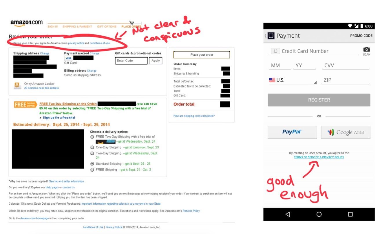
The relevant cases discuss these factors at length, but pictures tell a better story. Here’s a TOS link that wasn’t held to be clear and conspicuous (Amazon) as a matter of law and one that was (Uber):

The Second Circuit didn’t like the Amazon page because the link was in a small font on a cluttered page, not near the purchase button, and gave the user no reason to click it. In contrast, it liked the Uber page because the TOS was right there in ALLCAPs on an uncluttered page near the purchase button. That’s essentially the applicable law.
It’s Tough to Make a Clear and Conspicuous TOS in an App Store Listing.
That brings us to the point of this post. Because of the design constraints imposed by app stores, it’s not obvious how you should design your page so that the TOS is clear and conspicuous.
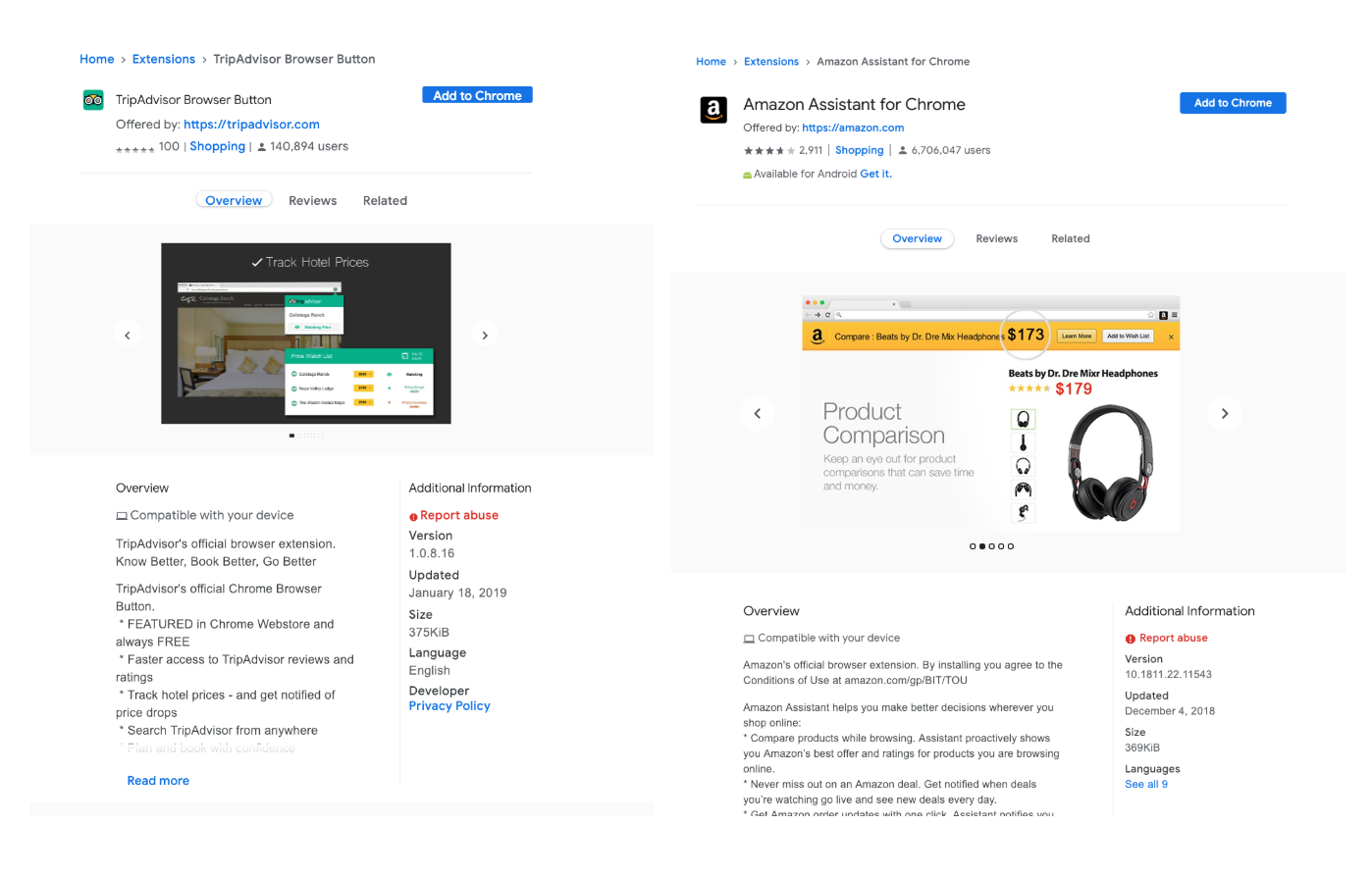
For example, here are two ways you could do it on the Google Chrome Extension store:

If you’re looking for the TripAdvisor TOS, you’re out of luck because it is hidden behind the “Read More” button at the bottom. That doesn’t pass the Second Circuit’s test.
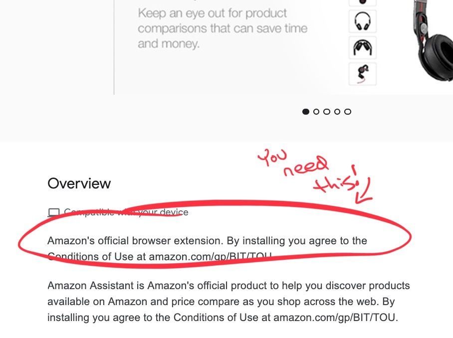
The Amazon page is a closer call. The TOS is there in the second line of the “Overview” section. Given the design constraints of the page, that might be the best they can do but it’s still not great--it suffers from a lot of the problems Amazon’s TOS had in the Second Circuit case. The Second Circuit’s admonition that the relevant language “is not bold, capitalized, or conspicuous in light of the whole webpage” equally applies to this app store page as it does to its Amazon website. Nicosia at 32. Further, “[t]here are numerous other links on the webpage, in several different colors, fonts, and locations, which generally obscure the message.” Id.
So how do you fix it?
It’s hard to say. The real solution is for Google to change the page design of its extensions to allow for a TOS somewhere at the top of the page. Good luck with that. In the meantime, bolding the TOS in the “Overview” section would help. Also, adding a link to the TOS under the Privacy Policy link on the right would be helpful.
This still matters if your users have to register to use your extension.
If you’ve read this far, you might be thinking “this doesn’t matter because my users have to register with my service—and click through our TOS—before they can use our app or extension.” Well, that’s only sort of correct. This enforceability issue could still cause you problems because your extension might have a security vulnerability in it (e.g., here and here), and so there’s a potential class of users who have your extension but never signed up for your service and so never agreed to your TOS and its arbitration-mandating, liability-limiting, class-action waiving provisions.
References:
- Stark v. SquareTrade (2d Cir. Jan. 10, 2019).
- Nicosia v. Amazon.com, Inc. (2d Cir. Aug. 15, 2016).
- Meyer v. Uber Technologies, Inc. (2d Cir. Aug. 17, 2017).